The type face or faces you use in your writing can have a profound effect on how your message is received and how people perceive you. In the long distant past, I learned how set type by hand and how to bind books – and I still love the whole process. The trays of different size fonts, the smell of the inks, being able to set physical type quickly (memorising where each letter is found in a type case) and being able to break down a page and return the different type pieces to their correct place, etc. One semester, I earned money printing all the signs that that the union put up to advertise events and did some t-shirt silk screening for event t-shirts. I even bound a course thesis – gaining an A if only for the pretty leather cover!
While much of the mechanisms of hand typography are now history, the value of specific fonts remains. If I were to post an article in Comic Sans, readers might not take it seriously. And posting my PowerShell scripts in a variable width font might make the script a lot harder to read. Using multiple fonts may seem like a good idea but end up confusing the reader. So many fonts, so many mistakes awaiting. Oddly enough type faces have been in the news a bit lately.
One of my favourite fun fonts is Comic Sans. I find it neat, elegant and informal. However today I discover that it’s the most hated font in the world. See the BBC’s on-line article: What’s so wrong with Comic Sans? I’m still convinced Comic Sans is not all that bad!!
Next I found an interesting albeit long article in the On-line Guardian entitled “True to type: how we fell in love with our letters.” This is a super article by Simon Garfield that examines the history of type faces, the care often taken in their design and some of the terminology of typography. I really enjoyed reading this article despite it’s length! It definitely brought back memories of hand type setting.
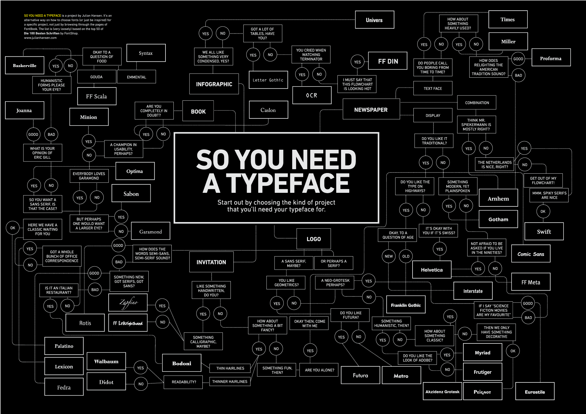
Finally, the thing that sparked this blog article. Having used fonts for many years, I guess I am aware of some of the pitfalls of a bad type face choice. For the most part, I tend to stick to what I like. I love Trebuchet for the body and title of this blog for example – and have done for some years. No one’s commented on it so I guess it’s OK. But for the uninitiated, I’ve found a super graphic that helps answer the question: what typeface should I use.
The graphic, effectively a large flow chart, is at: http://inspirationlab.files.wordpress.com/2010/04/infographiclarge_v2.png. This graphic starts by asking what sort of project you need a type face for (Logo, Invitation, book, etc.). Then it asks you some questions (are you completely in doubt, do you want new or older faces, did you cry when you watched Terminator). Based on that information, the graphic makes some suggestions. So if you are looking to create an infographic, that’s condensed and is without a lot of tables (oh and you did cry watching Terminator), use the OCR typeface for example. The graphic is a PNG, and you need to blow it up a bit in order to read it. But like the Guardian article, this graphic has been fun to look over!
So much like the number 11 bus – you wait for ages then three come along at once – today’s been a pleasant diversion into type faces. Now back to my day job.
No comments:
Post a Comment